
Work archive / material studies

Real page proofs make small business decisions easier to see.

This is a working archive, not a wall of invented case studies. It shows the things that can be inspected: a red pencil on a page proof, colour decisions on paper, a copy edit, and the modest pieces that help a business answer its next customer.

01 / What is here

Paper first. Useful after.

Every frame records an artefact or a stage of making. The archive does not attach a client name, conversion figure, award, or testimonial to an image when that information was not supplied. A good page still has to stand on what it does.

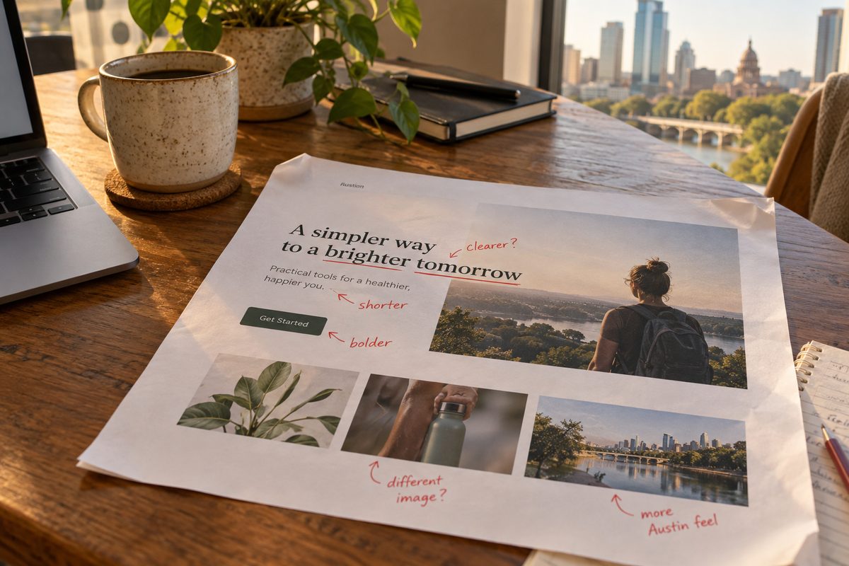
Red-pencil edits on a landing-page proof
A page proof with the useful sentence still under pressure.
Landing page / revision pass

A page has to earn its space.

The red pencil is where vague claims get removed, headings get shortened, and the order of an offer becomes visible. This is the material behind small business landing page design, before a responsive version is handed over.
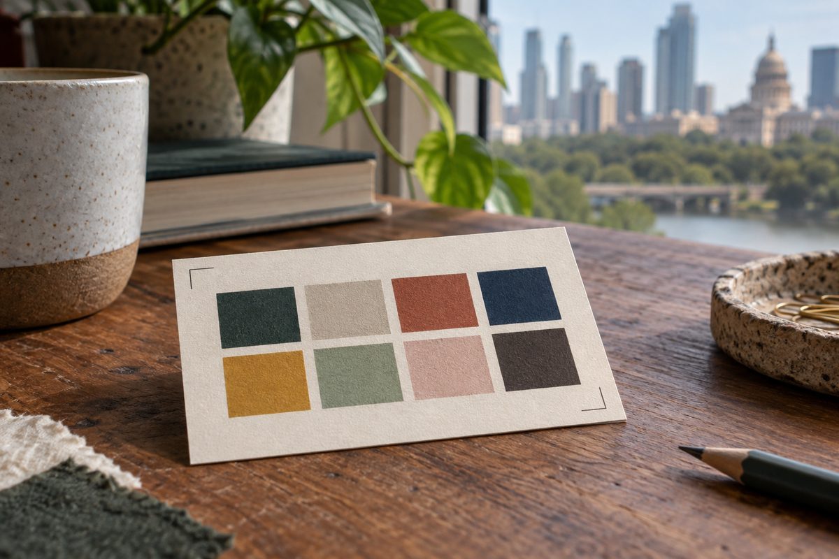

Colour swatches and a stamped identity study
Colour, type, and the stamped edge of a small identity study.
Identity / visual direction

A repeatable mark, not a corporate costume.

An Austin visual identity studio should leave behind decisions a small operator can use. This study keeps the set narrow: an oxblood direction, an aged-gold accent, type with a clear job, and paper pieces that do not require a manual the size of a novel.

Hands editing printed business copy
The sentence is tested on paper before it is put in a browser.
Copy / source-note edit

Plain language leaves fewer places to hide.

Business copywriting Austin operators can actually use starts with rough notes. The work keeps the facts with the owner, cuts the puffery, and gives each page a heading that says what the service is.

A service sheet and estimate template in a starter business pack
A small pack arranged around the next customer conversation.
Starter packaging / selected pieces

The file should be ready when the question arrives.

A starter branding package can be practical: a service sheet, an estimate template, a profile treatment, or simple print-ready collateral. The asset set is chosen after the inquiry. Nothing is added to make the project look more expensive.

A coordinated first-version set of page and identity pieces
A coordinated first version: page, words, and a few physical reminders.
Combined first version / scope study

One thread keeps the first version from pulling apart.

The combined first version joins a one page website studio approach with a small identity and copy pass. It is priced only after the parts and review rounds are agreed. It is for an operator who needs a clear public start, not a sprawling brand programme.

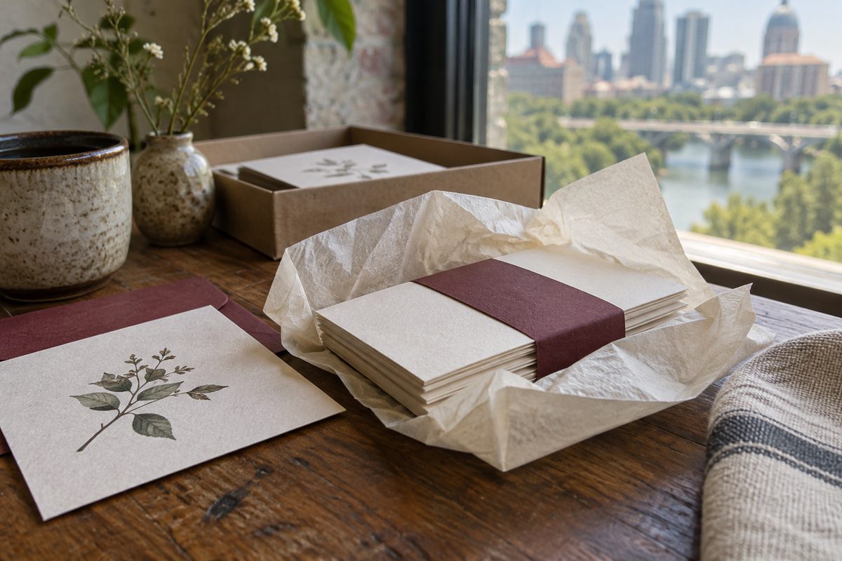
Layered cream paper with an aged-gold rule
A material study for the quiet parts of a system.
Material / edge and rule

Small details still need a reason.

Paper edges and a thin rule can establish a tone, but decoration is not a deliverable by itself. The useful question is where the treatment helps a customer recognise the business and where it should stop.

One mark, two typefaces, and a file you can actually open.

02 / What the proof means

No invented results attached.

The work shown here is evidence of making, not a promise about a business outcome.

A stranger can weigh whether the page is ordered, whether the words are plain, and whether the identity pieces can travel beyond one screen. They cannot weigh an invented percentage or a made-up client story. lunivexa leaves those out.

The price basis is written into the service scope. A focused landing page is priced per agreed responsive page scope and revision boundary. A small identity set is priced per agreed identity scope and export set. Copy is priced by page count and source material. The written inquiry decides which parts belong together.

A clear page gives the customer somewhere to start.

See the service rooms , then send the rough notes through an inquiry .