

This site is built to give more people a usable way in
Accessibility at lunivexa is practical work. Pages should be readable, operable with a keyboard, and understandable without relying on colour, sound, a precise pointer movement, or a fast animation.
What the accessibility approach covers
We aim to follow the useful parts of the Web Content Accessibility Guidelines, including meaningful structure, clear focus, sufficient contrast, and text alternatives. This is an ongoing working approach, not a claim that every browser, assistive technology combination, or future edit will behave perfectly.
The site uses ordinary HTML landmarks, one clear page heading, labelled navigation, and links that say where they go. The visual language uses cream, paper, oxblood, and aged gold, but colour is never the only signal for an action or status. A border, label, position, or text cue carries the meaning too.
Some content is supplied by the studio’s own work. Some content can change as services change. We review the public pages when meaningful edits are made and fix a barrier when someone points to one with enough detail to reproduce it.
Keyboard and touch operation
Every primary link, button, form control, menu action, consent choice, fit-checker option, and chat control can be reached with a keyboard. Visible focus uses an aged-gold outline against the surrounding surface. The mobile navigation opens from its labelled button and does not require a hover state.
Use the Tab key to move forward, Shift and Tab to move back, Enter or Space to activate a control, and Escape where a temporary panel offers a close action. On a phone, controls have a generous minimum target and text is allowed to wrap. There is no required drag gesture and no pointer-only information.
If a keyboard path gets trapped, a control has no useful name, or the order becomes confusing, report that exact point. A short description of the page and the action you were attempting is more useful than a general statement that the site is inaccessible.
Reading, contrast, and text alternatives
Headings are used to break long pages into real topics rather than decorative labels. Body copy is set for comfortable reading, and long legal pages have distinct section patterns so a reader can build a mental route through them. Links remain visibly identifiable. Text does not sit on top of an image where the image could make it hard to read.
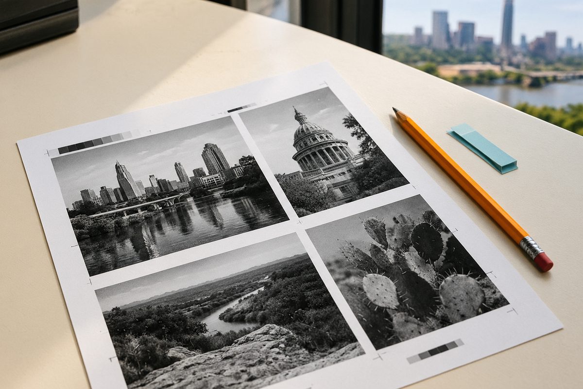
Photographs have alternative text that describes the useful subject. Decorative marks do not add a second spoken version of the brand. The logo image has a concise name, while the nearby link explains that it returns home. A photograph of paper is not described as if it contains text that cannot be read.
Browser zoom is supported. Layouts reflow from a narrow phone to a large screen without requiring sideways page scrolling. A wide table, where one is needed, owns its overflow so it cannot push the whole document beyond the viewport.
Motion is an option, never the price of entry
Page reveals, header changes, and small image movements add rhythm for visitors who want them. They do not carry essential information. The site responds to a visitor’s reduced-motion preference by removing transforms and shortening transitions. The content, links, forms, and consent controls remain available without animation.
There is no autoplay video and no interaction that depends on chasing a moving object. If a movement causes discomfort even with reduced motion enabled, close the chat or leave the page without losing access to the contact route. A direct email is available at [email protected].
Report a barrier and tell us what happened
Send an accessibility report to [email protected]. You can also call +1 (420) 555-3361 if email is not workable. Include the page address, the device and browser if known, the control or passage that caused trouble, and what you expected to happen.
You do not need to diagnose the standard or provide private information. A sentence such as “the navigation button has no visible change after keyboard focus on the services page” gives us a place to start. We review reports, test the described route, and reply with what we can do next. We do not publish a reporter’s details.
Clear route: email [email protected] with “Accessibility barrier report” in the subject, or call +1 (420) 555-3361. The studio is at 140 River Road, Unit B, Austin, Texas 11528.
For a request to access, correct, delete, or withdraw consent for personal information, use the focused data request route instead. For project corrections, see Warranty and Corrections.